




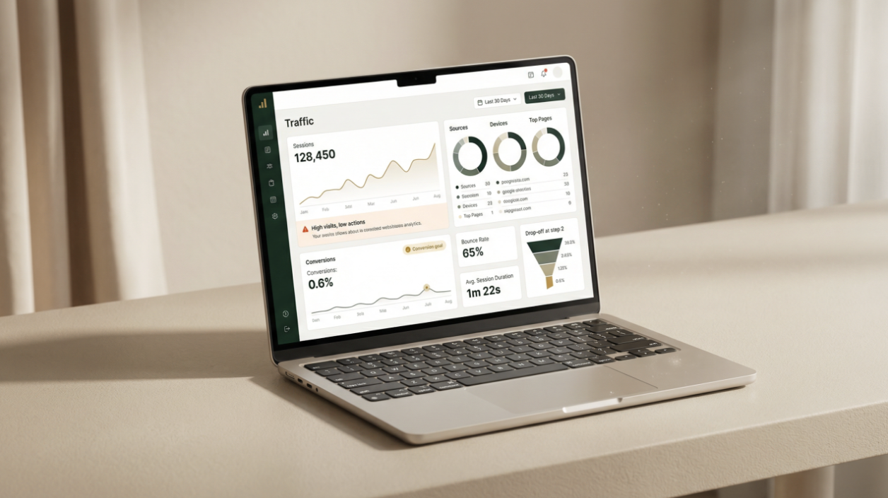
A founder opens their laptop after a long day. Traffic looks fine, the landing page is polished, the copy is thoughtful, the features are clearly explained, and the testimonials sit neatly below the fold.
And still, lead generation is at a minimal.
No errors or red flags. But still no one is interested.
The realisation is subtle. Nothing is technically broken and the site simply asks visitors to think too much. Each extra choice feels harmless on its own but together, they create hesitation. And hesitation rarely converts.
This is not a design problem. It’s a friction problem.
Why “More Information Builds Trust” Is Only Half True Many businesses assume trust grows with detail. More pages, more FAQs, more proof and more context.
It sounds logical, but it’s also incomplete.
Behavioural science suggests something else. When people feel overloaded, the brain shifts into caution mode. Extra decisions do not feel reassuring, but they feel risky.
One well-known study found that shoppers were ten times more likely to buy when offered 6 choices instead of 24. The same dynamic applies to websites.
Information can help. But only after clarity is established. Before that, it creates cognitive drag.
This is where many UX mistakes live. Not in what’s missing, but in what’s added with good intentions.
See content credentials Article content How Friction Shows Up In Real Life, One Small Step At a Time Friction is rarely obvious. It shows up as small steps.
A visitor hesitates at the menu. They reread the headline, wonder which button is right, and then they open a new tab instead.
This is cognitive load: the mental effort required to process information. When that load gets heavy, momentum slows.
Google research found that when page load time increases from 1 to 3 seconds, the probability of bounce rises by 32%. Speed matters.
Another study showed that reducing form fields from 4 to 3 increased conversion rates by nearly 50% in some cases.
Friction isn’t only technical. It’s emotional. People want to feel safe, oriented, and gently guided. Not tested.
Article content The 5-Minute Friction Audit That Reveals What Analytics Miss This audit is short. Five minutes. No tools required.
1. Choice overload Check: How many primary actions appear on the first screen? Why it matters: Too many paths create decision fatigue. Quick fix: Choose one primary action. Make everything else secondary.
2. Unclear call to action Check: Can someone clearly explain what happens after clicking the main button? Why it matters: Vague CTAs create hesitation. Quick fix: Use plain language. “Get the guide” beats “Learn more.”
3. Form friction Check: How many fields stand between interest and action? Why it matters: Each field feels like a small commitment. Quick fix: Remove anything non-essential. Ask later, not now.
4. Mobile speed and layout Check: Load the page on a phone and view it with fresh eyes. Why it matters: Over 60 percent of web traffic is mobile (Source: Statista, 2023). Quick fix: Prioritise the core message. Remove clutter above the fold.
5. Trust signals that work too hard Check: Are trust elements helping or distracting? Why it matters: Trust is emotional, not decorative. Quick fix: Replace generic badges with one clear, human proof point.
6. Confusing navigation Check: Can a visitor explain where to go next in five seconds? Why it matters: Uncertainty feels unsafe. Quick fix: Simplify labels. Reduce depth. Guide, don’t impress.
7. Copy that makes users work Check: Are sentences long, abstract, or dense? Why it matters: Reading effort drains momentum. Quick fix: Shorten sentences. Lead with outcomes. Write like a calm guide.
This is often the moment teams realise website friction isn’t about taste. It’s about empathy.
For brands looking for a steadier approach, partners like Bond & Vale often step in here not to add noise, but to align PR, marketing, and global communication services around clarity and restraint.
What Changes When Friction Leaves The Room Before friction is addressed, a website feels like a polite interrogation. Afterward, it feels like an invitation.
Visitors move with confidence. Decisions feel lighter. Conversion rates improve but so does something harder to measure: relief.
This is where strong user experience quietly supports reputation. A brand that respects attention earns it back.
If your website could speak, would it be calmly guiding visitors forward or asking them to prove they deserve the next step?